Rethinking the Humble Bio
Let's bring your attorneys to life.

At Herrmann, we believe that a critical goal for any website is to connect emotionally with its audiences. On a law firm website, there is arguably no greater way to spark that connection than through the attorney biographies. And yet, so many law firm websites treat their bio pages as an obligatory effort. Awkward yearbook style headshot? Check. Contact information? Check. Professional history and educational pedigree? Check and check. It's not necessarily that this structure is bad, but there is a glaring opportunity missed when clinging tightly to this format.
You see, clients don't just hire firms, they hire people. It's important to remember that your bios can be more than just a vehicle to list credentials. Sure, relevant experience matters. But so does personality and philosophy. Those can go a long way as well.
So, how do you capture and convey those intangible—but important—characteristics on a bio page?
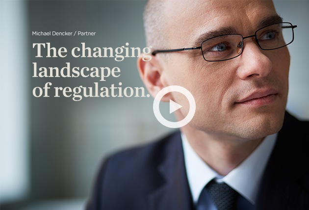
Let's start with photography. Numerous studies have demonstrated that photos are often the first thing that users notice and process on a webpage. Consider playing with size and scale—the larger the photo, the more impact it can create. Large photography serves as an powerful visual entry point, balances out content-heavy design compositions, and can capture dimensions of a personality that are often concealed in a thumbnail-sized photo.
Another avenue to explore with photography is the interesting use of angles, lighting and diverse backgrounds. Varying the positions and location settings of attorneys adds interest to pages and provides a sense of place. Showcasing attorneys in different contexts introduces visual diversity and can also help express more personality. Keep in mind, however, that whatever style you choose must have the flexibility to be consistently recreated across multiple offices and locations as new attorneys join the firm.
Other effective elements on bio pages include big statements and quotes. A few well considered words can summarize an individual's ethos and credibility far more effectively than paragraphs and paragraphs of historical background. These typographic devices offer an immediate glimpse into the guiding values of an attorney, and alongside credentials, they can paint a far more complete snapshot of an individual. Additionally, adding areas outside of law such as interests and hobbies can provide even more insight into personality.
One challenge we often run across with bio pages is the length, depth and complexity of content required. Background information, credentials, relevant experience and education can all be important factors in the consideration process, but presenting that content elegantly to users be difficult. This is where we rely on other visual interface devices such as color, subheads, iconography, tabs and accordions as ways to organize and display information more intuitively.
But the emerging game changer on the web is video. Video is increasingly become the preferred vehicle for the consumption of content online, and for good reason. An effective video can capture the voice and personality of an individual in ways that other mediums simply cannot accomplish. And this trend is only growing stronger. Google has recently updated its search results to now include video content—a clear indication of its growing influence in the interactive space. Producing videos, however, is no small undertaking. It can be time-consuming and costly. When done well, however, its impact is unparalleled.
To be clear, these idea are not exclusive to attorney biographies. Video, compelling photography, scannable content, and the effective use of interface design will bring your brand to life and benefit your entire site. In many key ways, your website is often the start of a relationship. Thinking creatively about your content and messaging can help make that relationship instantly endearing.


